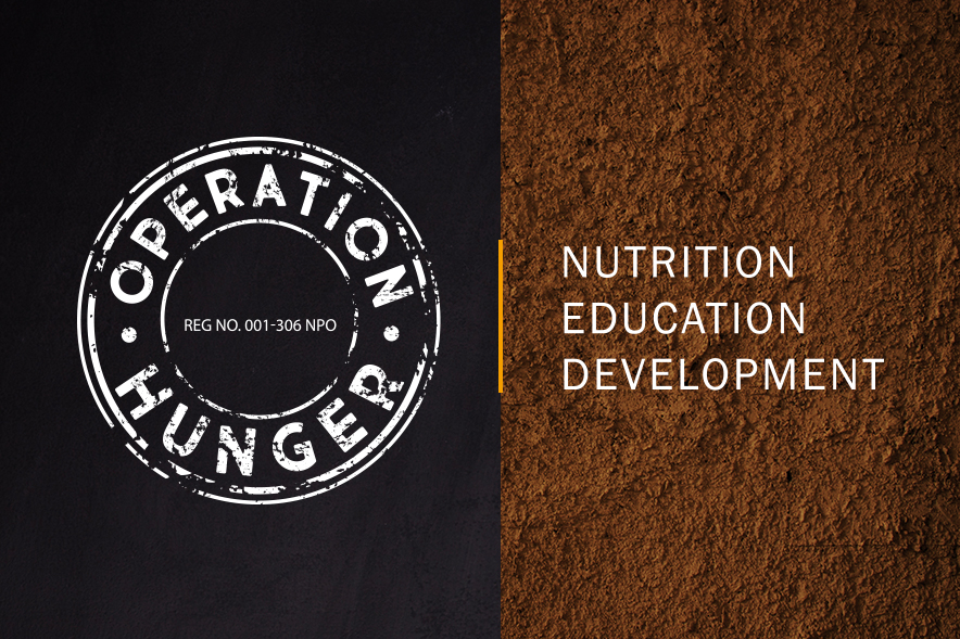
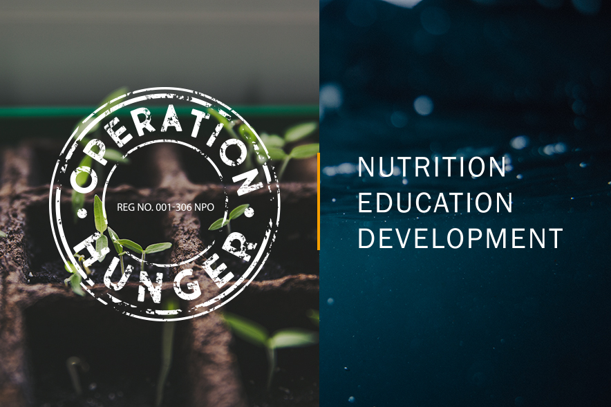
As part of Egg’s social responsibility initiative, we recently teamed up with Operation Hunger to revamp their corporate identity and assist with a series of marketing campaigns to help drive donations towards their worthy causes.
The first step of our journey with Operation Hunger was to refresh their logo without losing its 35-year legacy. We did this by retaining the distressed stamp device, but improving the letter spacing, creating a more contemporary font and adapting the strapline in order to modernise the logo's overall look and feel.